Buttons are a key element in getting the desired action from users, thus play a major role in website conversion rate. Professional web designers understood this a long time ago, this is why when designing a website, they pay special attention to buttons, making sure that they are perfect and will generate a high conversion rate from users.

In this tutorial, we will also try achieve this and will see how to create a unique design, CSS 3 Button, with a gradient as the background.
The end result
The HTML
We will start our button by creating a regular link with the class selector set to “gr-button“.
<a class=”gr-button” href=”#”>Demo Button</a>
The CSS
Defining the general style
After creating the link and defining its class selector, it’s time to write the CSS code. For this, we will use the earlier assigned class “gr-button“, as shown below.
.gr-button
{
/* Code Here */
}
The first thing to do is to give our button a “skeleton”, by setting the “display” property to “inline-block”
and creating a 1px
border with the color set to #a0cd52. After this, we need to change the “padding-left” and “padding-right”
properties to 14px. By doing so, the distance between the text and the button’s edges will be 14px, both on the left and right edges.
.gr-button
{
display: inline-block;
border:1px solid #a0cd52;
padding-left:14px;
padding-right:14px;
}
Setting up the background
After we have created the “framework” of our button, it’s time to give it a background color. For this, we will use the “gradient”
property, that CSS3 has. Our gradient will be linear, from “left-top” to “left-bottom” with the stop colors being set to #cae285 and #
a3cd5a. To make the gradient cross browser compatible, we will use “linear-gradient”
for Internet Explorer (IE 10+), “-webkit-gradient” for Chrome, “-moz-linear-gradient” for Firefox and “-o-linear-gradient” for Opera.
We’ve also set the “background color” to #cae285 for the old browsers which do not support the background gradient property.
.gr-button
{
background-color: # cae285; /* For browsers not supporting gradient background*/
background: -ms-linear-gradient(top, #cae285, #a3cd5a); /* IE10 */
background: -webkit-gradient(linear, from(#cae285), to(#a3cd5a)); /* Chrome 1-9 */
background: -moz-linear-gradient(top, #cae285, #a3cd5a); /* Firefox 3.6+ */
background: -webkit-linear-gradient(top, #cae285, #a3cd5a); /* Safari 5.1, Chrome 10+ */
background: -o-linear-gradient(top, #cae285, #a3cd5a); /* Opera 11.10+ */
}
Stylishing the Text
Since we create our button based on the <a> tag, the text inherits all its style from it, including the blue color and the underlining, which for a modern, high conversion button are not acceptable, so we must changh it.
For this we will set the font to “Arial, Helvetica“ with a font size of 16px and a black color (#555) for the text. To remove the text underlining which occurs by default on every link, we will set the “text-decoration“ property to “none“. We will also make our text bold by setting the “font-weight”
property to “bold”
and will use a 25px
line-height for it. In the end of this step, we will give our text a 1px vertical shadow, with a slightly whiter color (#d5e8aa) than the current color of the button’s background (#cae285). As an extra, we will set the outline property to “none” so that dotted line outside the button’s border, would not occur when we click on it.
.gr-button
{
font-family:Arial, Helvetica, sans-serif;
font-weight: bold;
font-size:16px;
line-height: 25px;
color: #555;
text-decoration: none;
text-shadow: 0px 1px 0px #d5e8aa;
outline: none;
}
Until now, we have managed to create a button that looks much closer to the end version of the button we try to create, but there are still many elements missing, so we proceed to the next step in creating our button, where we will “round” the right corners.
Creating round corners
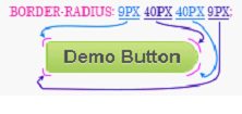
If in the past this was a nearly impossible thing to accomplish with pure CSS, now this is a piece of cake, and it’s all thanks to CSS3. We just set the “border-radius“ property and the round corners are ready.
The value for the border radii are given in the order top-left, top-right, bottom-right, bottom-left, so for example, if we want to make a shape that will look like a “bullet” we need to give the first and last corner a much lower value than the value of the middle corners.
To make this property cross browser compatible, we will also add “moz-border-radius“ for firefox based browsers and “webkit-border-radius“ for chrome and safari based browsers.
In our example, we gave the “border-radius” property, the following values:
.gr-button
{
border-radius: 9px 40px 40px 9px;
-moz-border-radius: 9px 40px 40px 9px;
-webkit-border-radius: 9px 40px 40px 9px;
}
We have also added a small 1px black shaddow in this step, with opacity set to 20%, so the final css code for this setps looks like this:
.gr-button
{
border-radius: 9px 40px 40px 9px;
-moz-border-radius: 9px 40px 40px 9px;
-webkit-border-radius: 9px 40px 40px 9px;
box-shadow:rgba(0,0,0,0.2) 0 1px 0 0;
-webkit-box-shadow:rgba(0,0,0,0.2) 0 1px 0 0;
-moz-box-shadow:rgba(0,0,0,0.2) 0 1px 0 0;
}
Defining the “hover” selector
As you can see from the previous step, our button looks like it is ready, but it has an important component missing – the hover selector. “Hover“ is a CSS selector used to select elements when you place the mouse over them. The “hover“ selector can be used on all elements, including on links, as you will see for yourself in this step.
In our example, we have set the hover selector to inverse the stop colors of our previous gradient, so instead of a gradient with colors from #cae285 to #a3cd5a, we will use # a3cd5a #cae285 as the stop colors for the gradient. We also need to make this cross browser compatible, so in the end, we will have something like this:
.gr-button:hover{
background-color: #a3cd5a; /* For browsers not supporting gradient background*/
background: -ms-linear-gradient(top, #a3cd5a, #cae285); /* IE10 */
background: -webkit-gradient(linear, from(#a3cd5a), to(#cae285)); /* Chrome 1-9 */
background: -moz-linear-gradient(top, #a3cd5a, #cae285); /* Firefox 3.6+ */
background: -webkit-linear-gradient(top, #a3cd5a, #cae285); /* Safari 5.1, Chrome 10+ */
background: -o-linear-gradient(top, #a3cd5a, #cae285); /* Opera 11.10+ */
}
Editing the “active” selector
The “active” selector is used to set the CSS style of a link when the user clicks on it. In our case, when the user will click on the button, the regular “.gr-button“ CSS will be replaced by the “.gr-button:active” CSS.
.gr-button:active
{
/* New css code*/
}
Since we are creating a button, we need to make an effect that will create the impression that the button is being pressed. For this, we need to move the button 1px below its initial position, by setting the “top” property to 1px and defining the “position” as “relative” .
.gr-button:active
{
position:relative;
top:1px;
}
And this is it. We have finally managed to create the high conversion button that we wanted. Hope you enjoyed the tutorial. If you have any questions, do not hesitate to use the comment box.
To see the live demo and to download the buttons, please go to the below link.


